St. Louis Hot Sauce
Marketing/Packaging
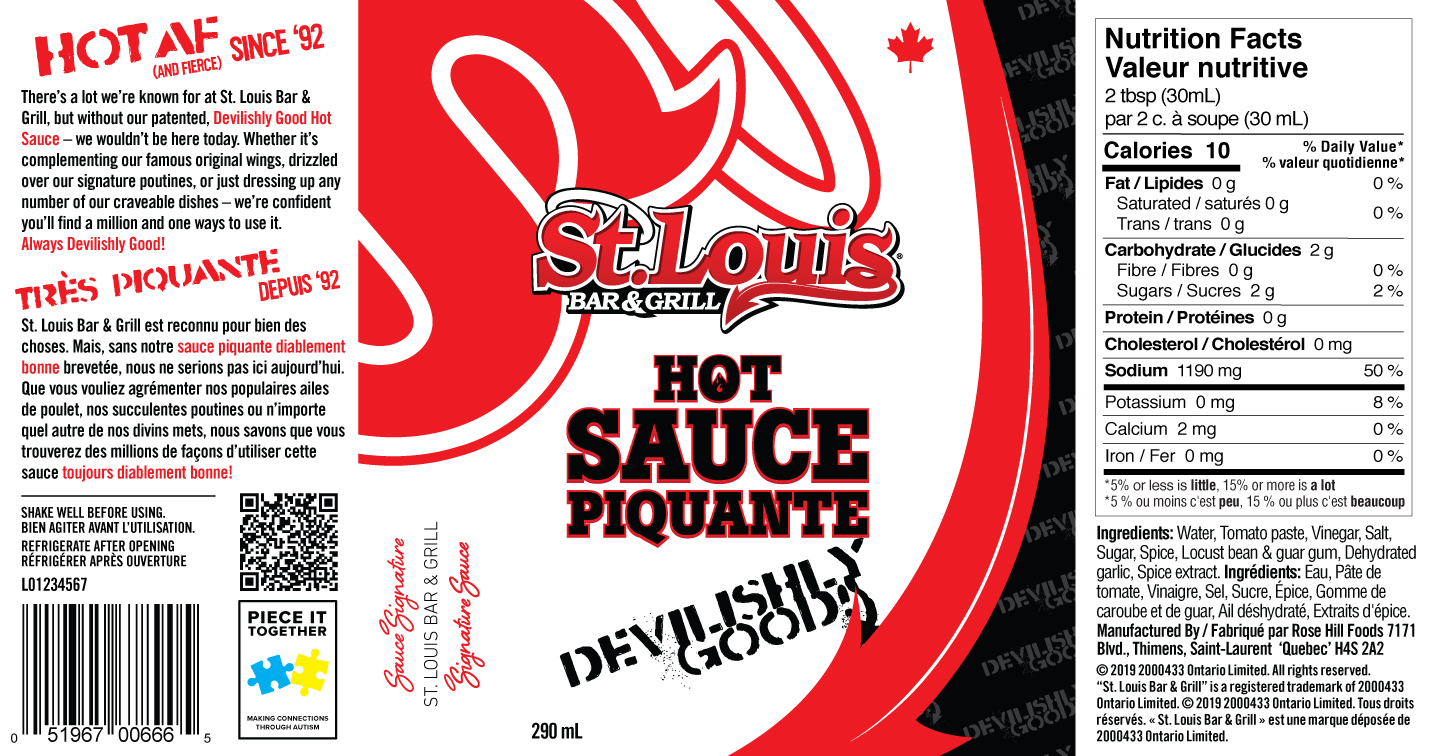
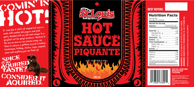
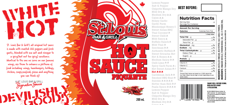
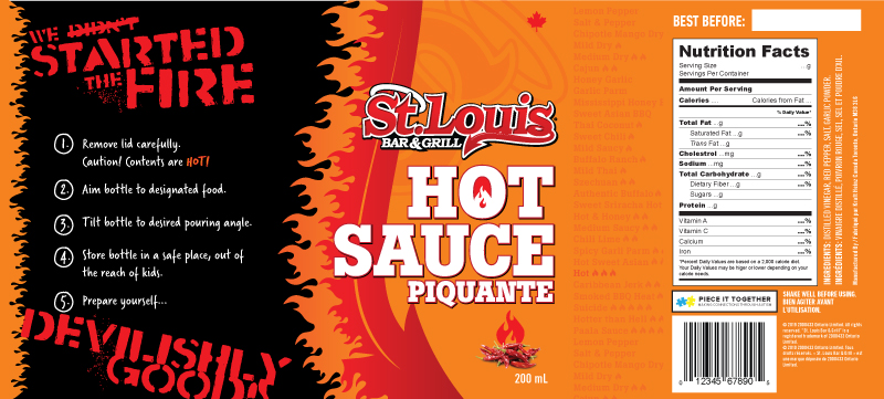
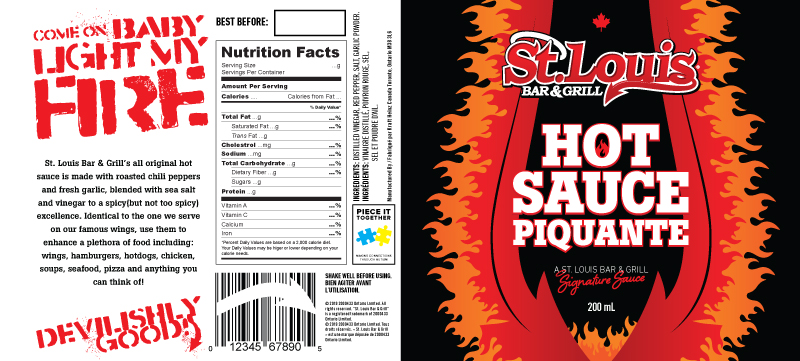
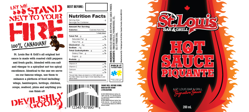
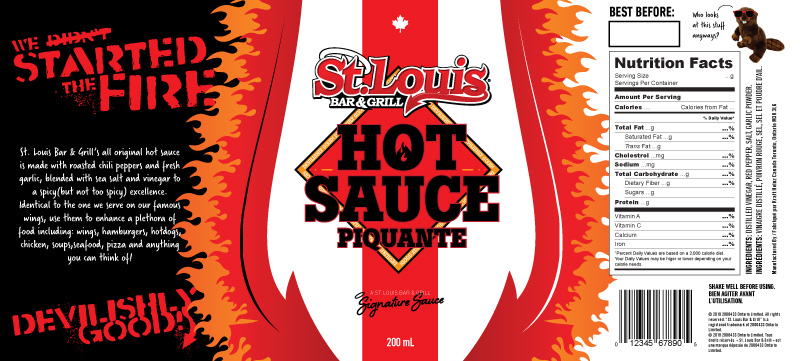
Part of the brand expansion into the consumers’ homes, I was tasked with designing creative for the in-restaurant advertising and a label for the hot sauce bottle itself. With the possibility of sitting on a retail shelf, the label needed to stand out against all the other hot sauce labels for new customers and be familiar to existing customers. The “S” watermark is synonymous with St. Louis brand elements and only second to the devil’s tail which both capture the familiarity regulars know and love.
The predominantly white label was chosen because it clashes with the dark, and cliche fiery tones that dominate hot sauce labels on grocery shelves. I chose to use the slogan as a repeating pattern for the top and side and created a “signature sauce” lockup to give it a premium touch. “HOT AF (AND FEIRCE) SINCE ’92 speaks to the tone and history of the brand.
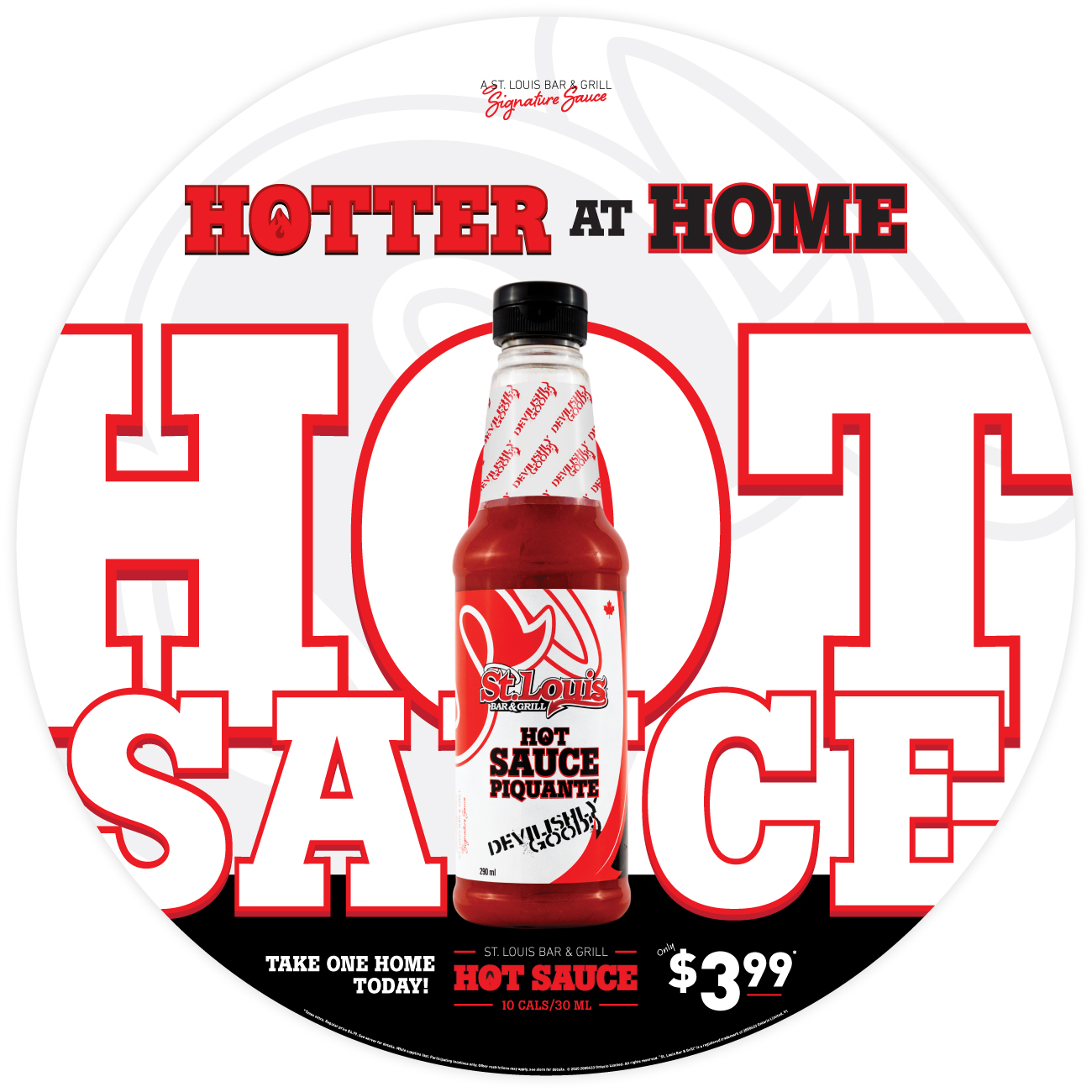
The design for the advertising is type driven and since the photograph was pretty self explanatory, I had some freedom to play around with the letters in a geometric space rather then worry about the legibility. The black runner along bottom anchors the top and provides a high contrast area for the price point.

