#WGACSFT

Art Direction/Photography/Motion Design

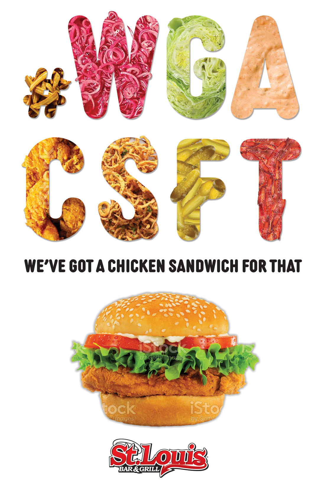
During the winter of 2021, the pandemic had many parts of Canada in lockdown. Most, if not all St. Louis restaurants were forced to close, which made this the first primarily digital, large promotional campaign that we’ve run. With a heavy emphasis on digital, the creative needed to be quick, intriguing and bold. WGACSFT is an acronym tagline that was made to stir up intrigue and leave a quick impression. I was responsible for taking the brief and designing a concept to match the criteria but also adhere to the St. Louis visual brand.

Thanks: Creative Direction – Royal Nasager
Production Design – Adam Gold
Social and Digital Strategy – Erica Konstinanidas
Food Stylist – Jeff Hartle
Photography Assistant – Jennifer Peach
Video/Cinematography – Adrian Kieda
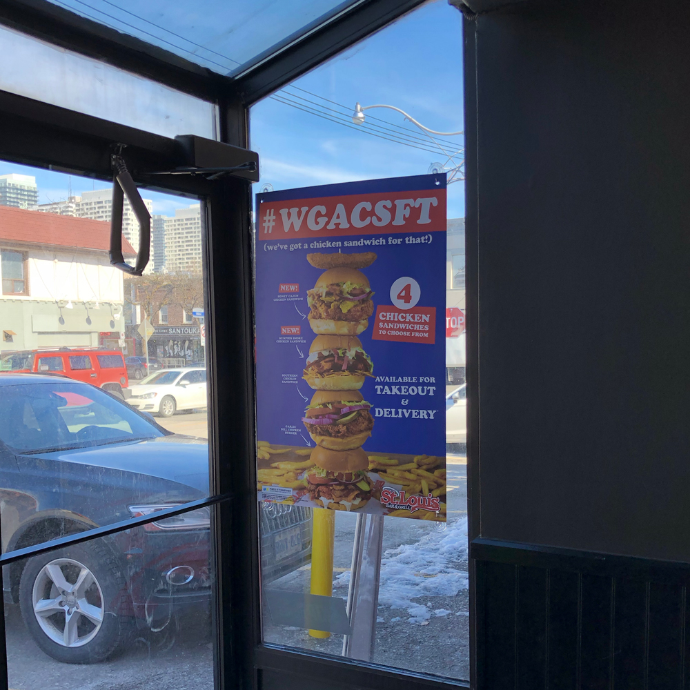
Poster

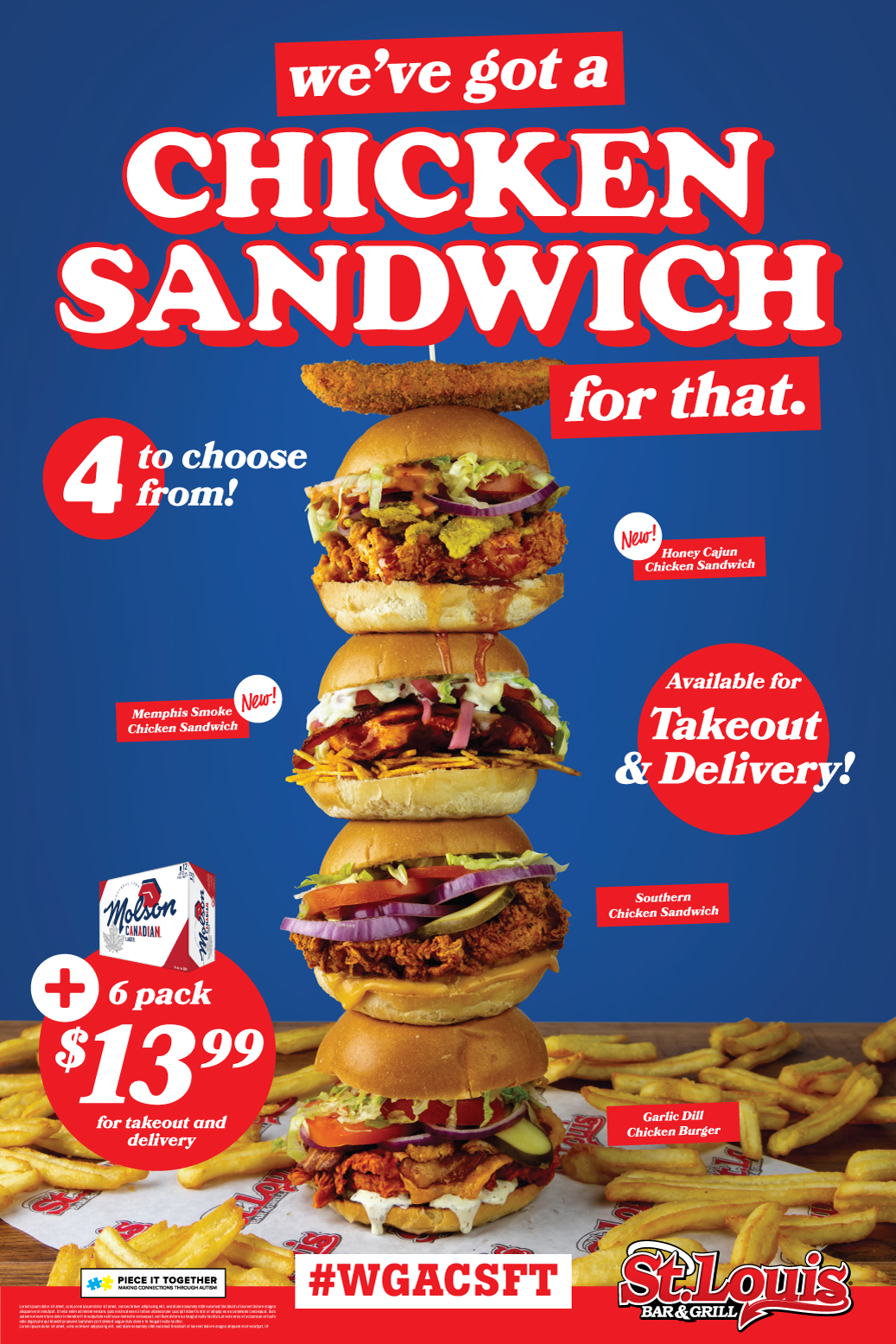
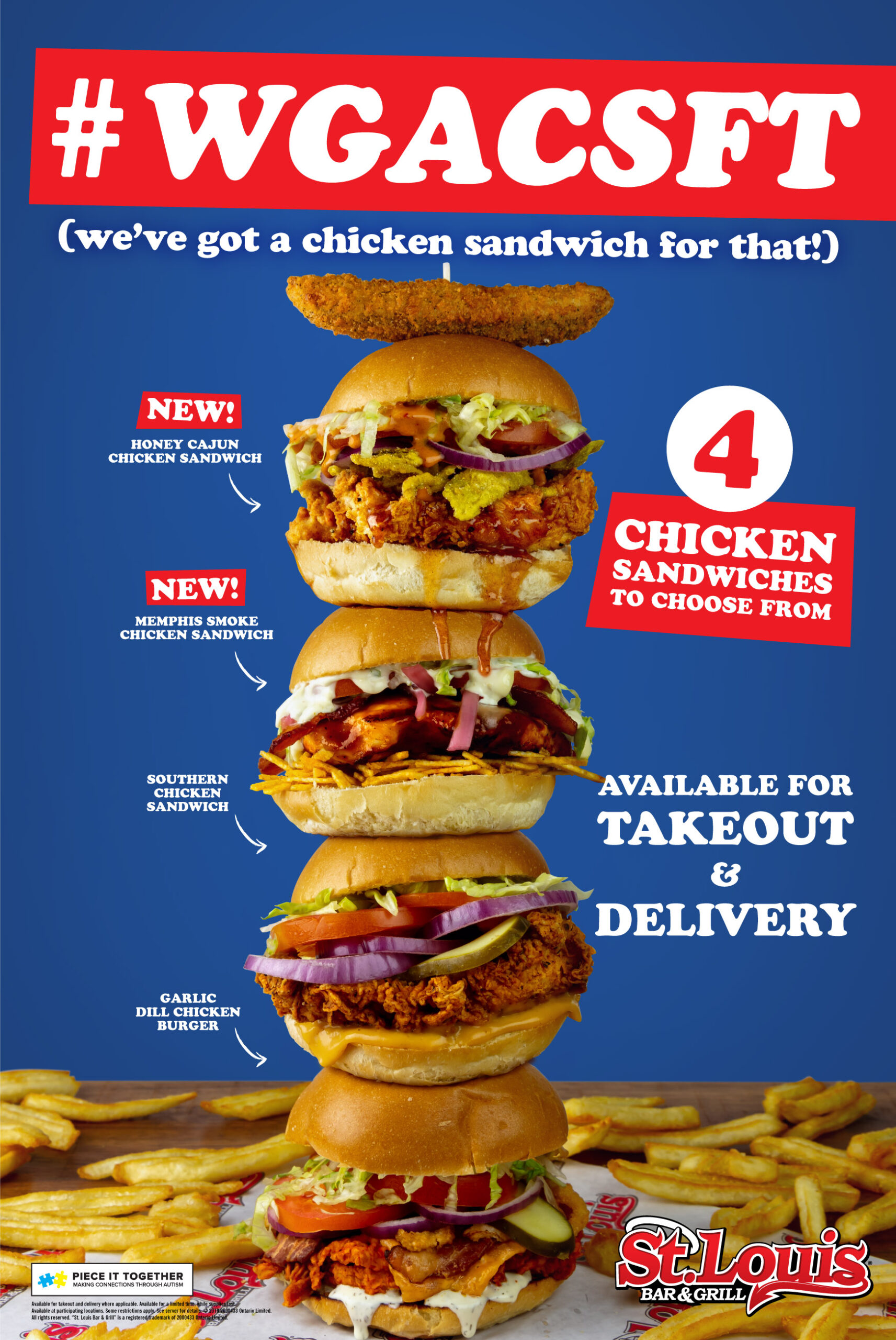
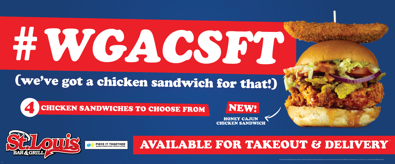
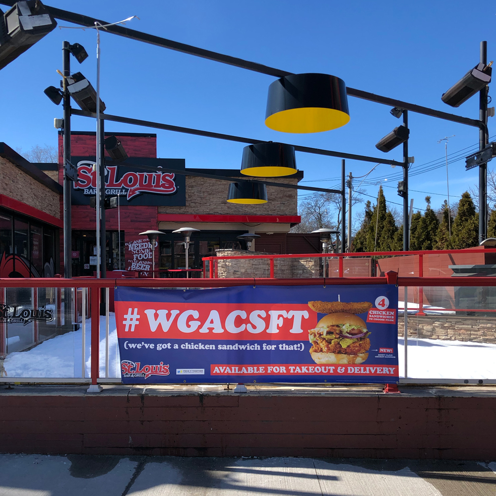
In the midst of Ontario’s second lockdown and the peak of pandemic fear, the design needed to be light hearted and tongue in cheek. Cooper black was an obvious choice to convey that tone while keeping it playful. The timeless font matched with simple primary colours generated a comforting visual while the refreshing blue background provided a high contrast ratio for the featured chicken sandwiches.

Banners
Landing Page

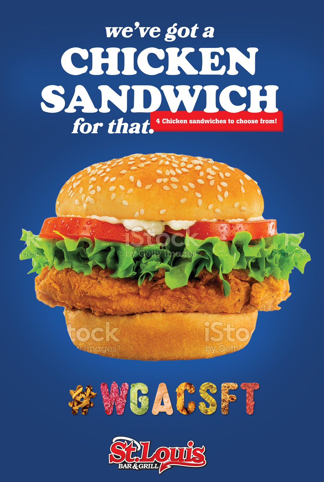
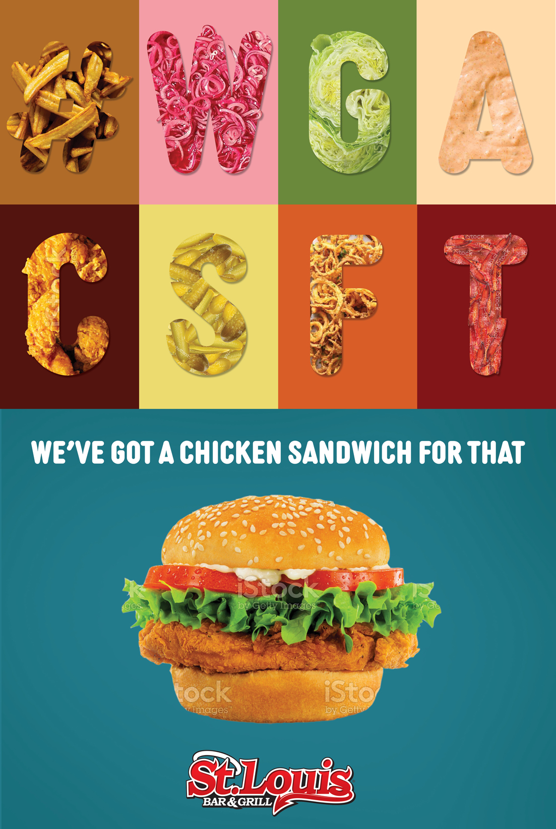
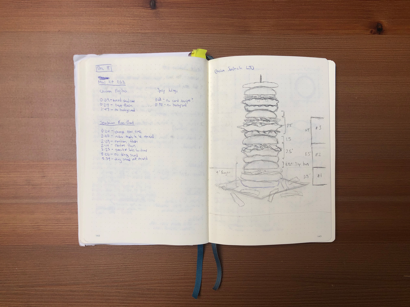
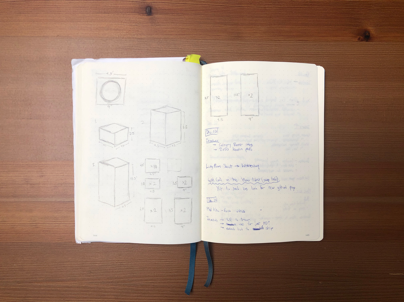
Concepts
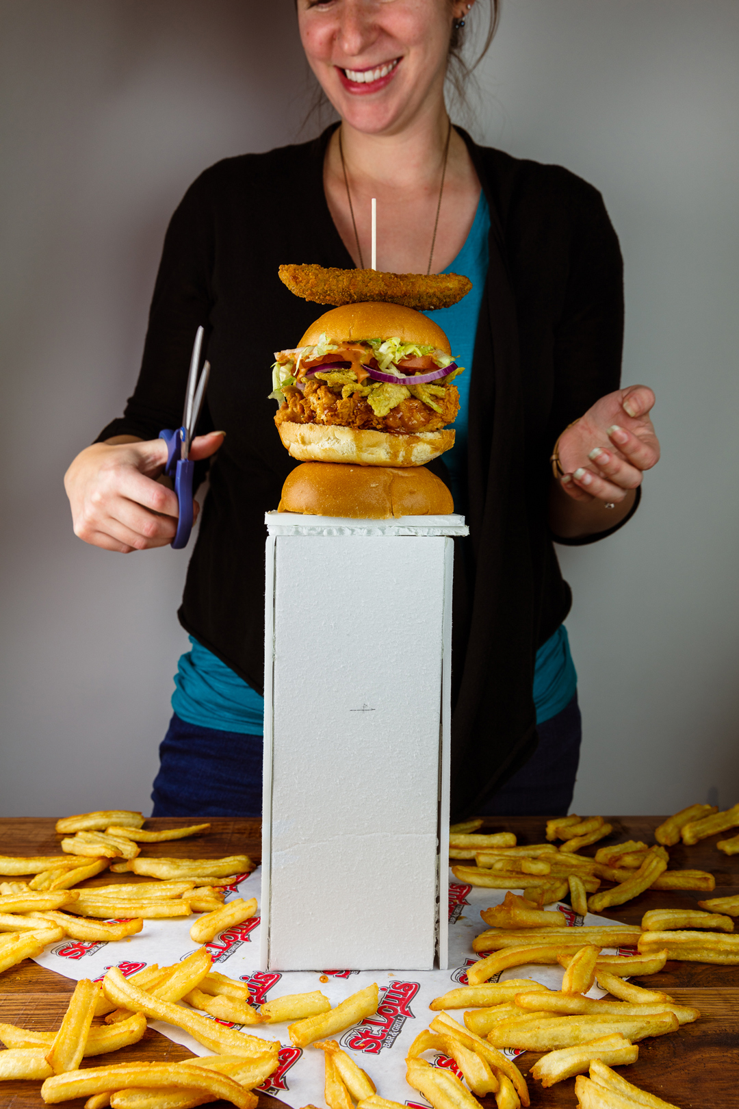
Behind the Scenes

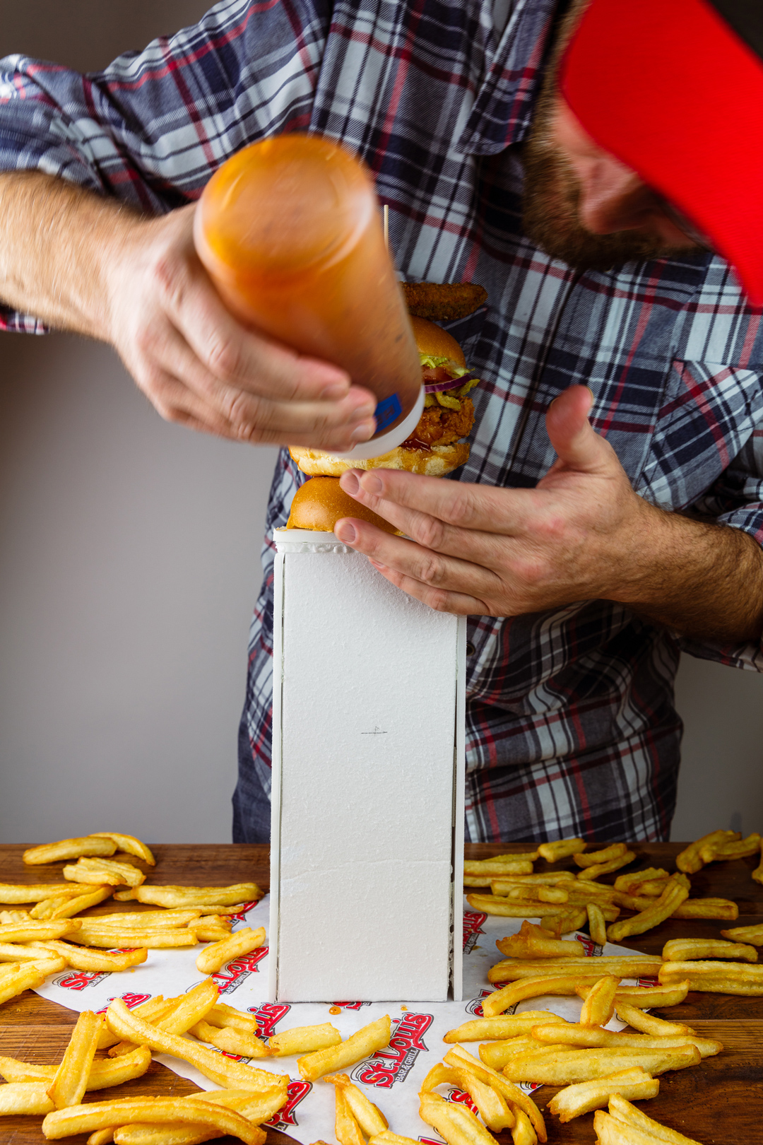
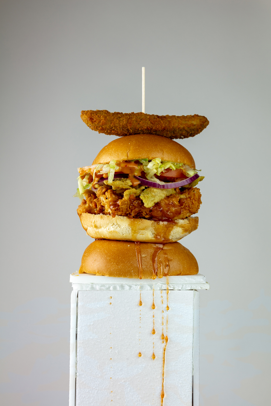
The rising popularity of chicken sandwiches among QSR and fast casual restaurants, meant that the photography needed to stand out from competitors and the traditional presentation of a burger/sandwich. With a vertical totem pole, it was an atypical but effective way to convey that our chicken sandwiches were not only unique, but stood tall (figuratively and literally; these sandwiches were huge). By stacking them, I could show them off as one unit instead of individually. The Fries surrounding the stack are made to look like fallen soldiers and debris on a battlefield as if there was an explosion where the sandwiches had landed.

Motion Design

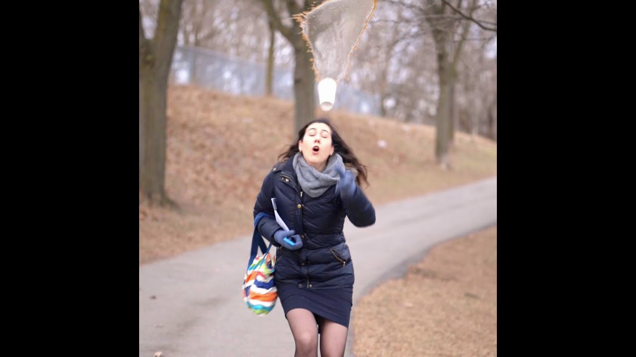
The motion design added to the light hearted element of the creative. Visually, having it occupy the entire screen and then spinning on to the title card allowed for a smooth transition between the gag and the final campaign/CTA. Audio-wise, combining a spinning propeller and overlaying a squish, crunch and gunshot lent itself to a more comedic manner, again presenting the light heartedness and the experience of the sandwich (in the crunch).

Instagram Story

Instagram Posts

Videos
Privacy Settings
We use cookies to enhance your experience while using our website. If you are using our Services via a browser you can restrict, block or remove cookies through your web browser settings. We also use content and scripts from third parties that may use tracking technologies. You can selectively provide your consent below to allow such third party embeds. For complete information about the cookies we use, data we collect and how we process them, please check our Privacy Policy
Youtube
Consent to display content from Youtube
Vimeo
Consent to display content from Vimeo
Google Maps
Consent to display content from Google